
Moments in #real-time:
a brand discovers its essence
Alpenpalais Kroell
Slowing down rather than seeking thrills, a sense of comfort and warmth rather than glossy glamour: in Schenna, above the Merano basin, Petra Kröll and her son Philipp run their Hotel Kröll, offering warm hospitality, regional cuisine, and a spacious garden that invites guests to linger. What had long been a feature of this special atmosphere was the question of how all of this could be brought together under a clear brand. Kröll developed the answer in collaboration with Brandnamic: the result is a positioning strategy that captures the essence of the company without distorting it.
At the heart of Kröll lies an ethos that Petra and Philipp have always lived by: a holiday is a time to unwind, not to work through tasks. From this grew the vision of a temporary home that places a sense of comfort, mindfulness, and indulgence at its centre – not a place for fast-paced consumption, but for genuine moments of well-being. This approach should no longer be noticed only by those who have already been there, but should be recognisable from the very start: in a distinctive brand that makes the hotel unmistakable whilst naturally supporting the generational handover from Petra to Philipp.
It all began with a clear idea of what the hotel stands for, but without a unifying theme to bring it to life. Working alongside the hosts, Brandnamic developed this theme in a series of progressive stages:
- the event kicked off with a positioning workshop led by Brandnamic consulting and hotel coaching. This was the first time that what makes the Kröll special was put into words.
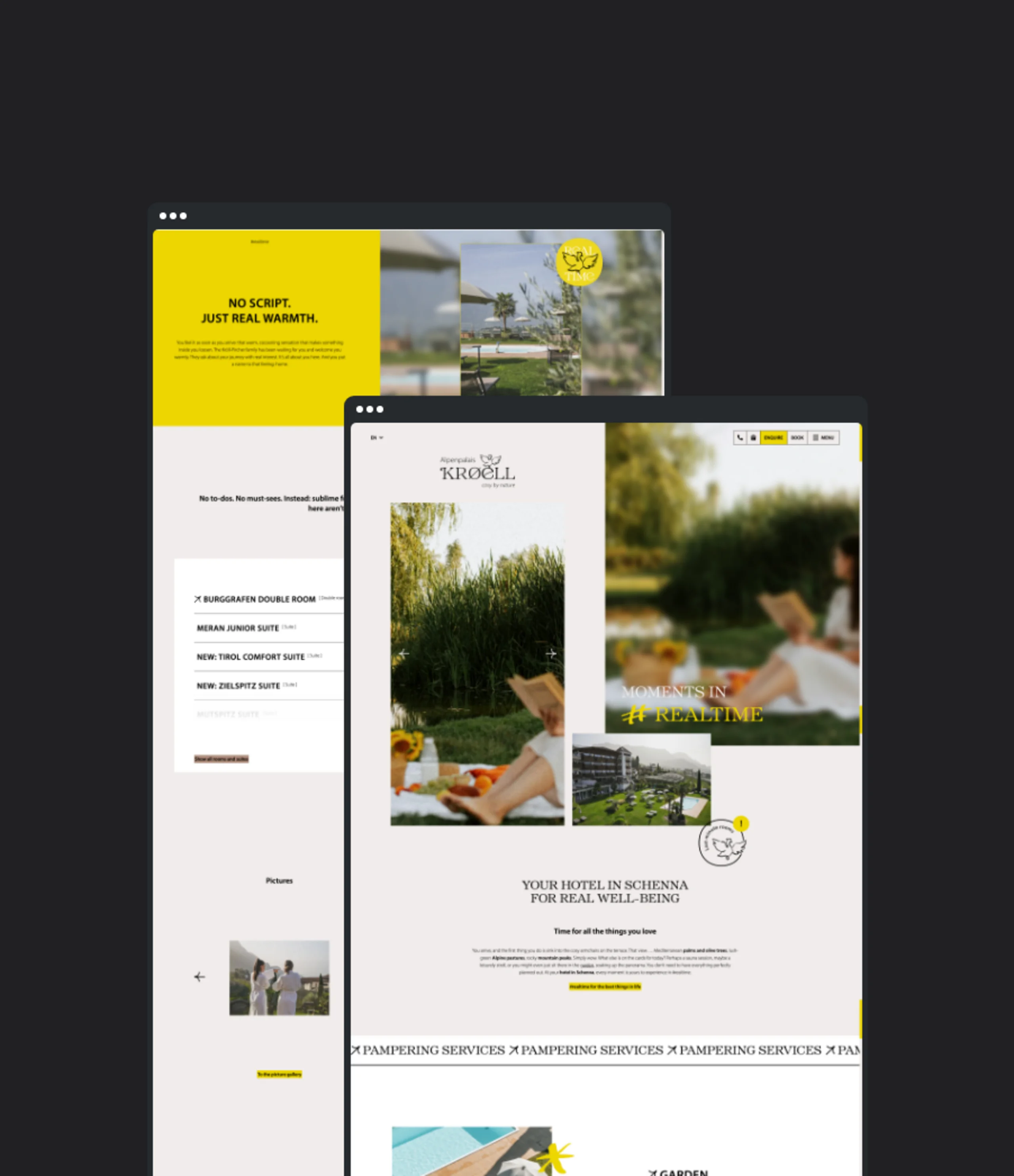
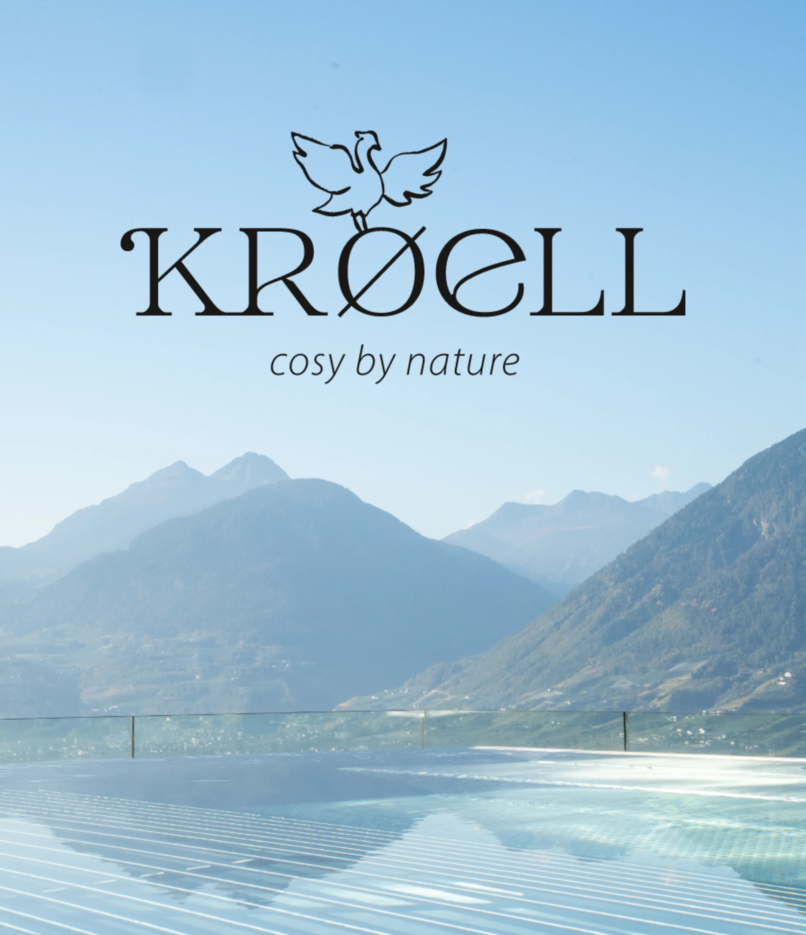
- As the previous logo no longer reflected this approach, the hotel was given a new one – and a shorter name: Alpenpalais Kröll became simply Kröll. The fact that the suffix “Alpenpalais” is still used from time to time is a deliberate choice on the part of the hosts; it’s part of the hotel’s history.
- Once the claim “Cosy by nature” had captured the essence of the Kröll, the communication concept centred on the brand keyword #echtzeit (realtime) took shape – complete with corporate language and its own vocabulary.
- The new website finally brings together the brand positioning, language, and visual identity in one place and shares them with the outside world.
Today, Kröll knows what it stands for and is able to convey this to the outside world – thanks to positioning, language, and design that work together. The establishment comes across as more modern, independent, and self-assured, without losing its original character. Petra and Philipp Kröll-Pircher can deliberately build on what makes them strong: warm service, regional cuisine, and the natural garden at its heart. As a result, the vision of a temporary home is noticeable not just once you arrive, but right from the very first contact – as an invitation to moments in #realtime.
Positioning | Logo & corporate design | Claim | Communication concept | Website

“We’ve always had a clear vision of what a stay with us should feel like. Now we can finally show that to the outside world. From the logo to the communications strategy and the website, everything comes together to form a cohesive whole that perfectly reflects our establishment.”


