It’s all about The View:
when the view turns into a brand
Vista Lakefront Boutique Hotel
Ascona. Dolce vita. And a front-row seat right on the shores of Lake Maggiore. When Vista Lakefront Boutique Hotel approached us to rebrand, the strategic direction quickly became clear: this isn’t just about beds and rooms. It’s all about the view. For the panoramic view that greets guests as they wake in the morning and lulls them to sleep in the evening. We’ve taken this unique USP and turned it into a comprehensive package that offers a fresh perspective, presented in the brand’s new colours of gold and white.
Behind the scenes: rigorous in analysis, sensitive in creation
For us, behind every magical creative moment lies a solid, logical foundation. Before the atmosphere of Lake Maggiore could take hold of the room, we delved deep into the figures:
- Always putting the guest first: Not just armchair theory, but an in-depth analysis of markets, target groups, and their very specific needs. What are today’s guests looking for when they travel to Ascona?
- Performance meets poetry: It was only once the strategic foundation was rock-solid that we made the lake the centrepiece of the presentation, so that our clients could experience it with all their senses.
- The interplay of light and elegance: The new brand colours, white and gold, set the tone in the room: white symbolising the clarity and vastness of the light by the lake, and gold representing refined elegance and the glint of the sun on the water.
- Sharpening the senses: The gentle lapping of the waves as a soundtrack, the scent of fresh citrus fruits in the air, and the taste of a genuine Italian espresso on the tongue have made the true Vista experience palpable even before the launch.
Before vs. After: from potential to a shining highlight
- Before: four properties in one of Ascona’s prime locations, whose digital and visual presentation has not yet fully captured the panoramic views and the exclusivity of the location.
- After: an emotional yet highly functional brand architecture that serves as a strong umbrella uniting all five business units. Under the shared brand identity, the group’s two hotels, the gourmet restaurant, the pizzeria, and the golf club restaurant present themselves as a harmonious whole. Every design element, every line of text, and the entire digital presence showcase this multifaceted hospitality experience in such a way that it immediately sparks desire and delivers measurable results.
The all-in-one package: a change of perspective
From this clear inspiration, a harmonious whole has emerged – a presentation that truly lives up to the name Vista (the view):
- The foundation: a razor-sharp brand concept that defines The View as the central brand anchor, charging it with emotion and showcasing it perfectly through colour.
- The message: a dynamic communication concept that speaks the language of the South – elegant, open, and inviting.
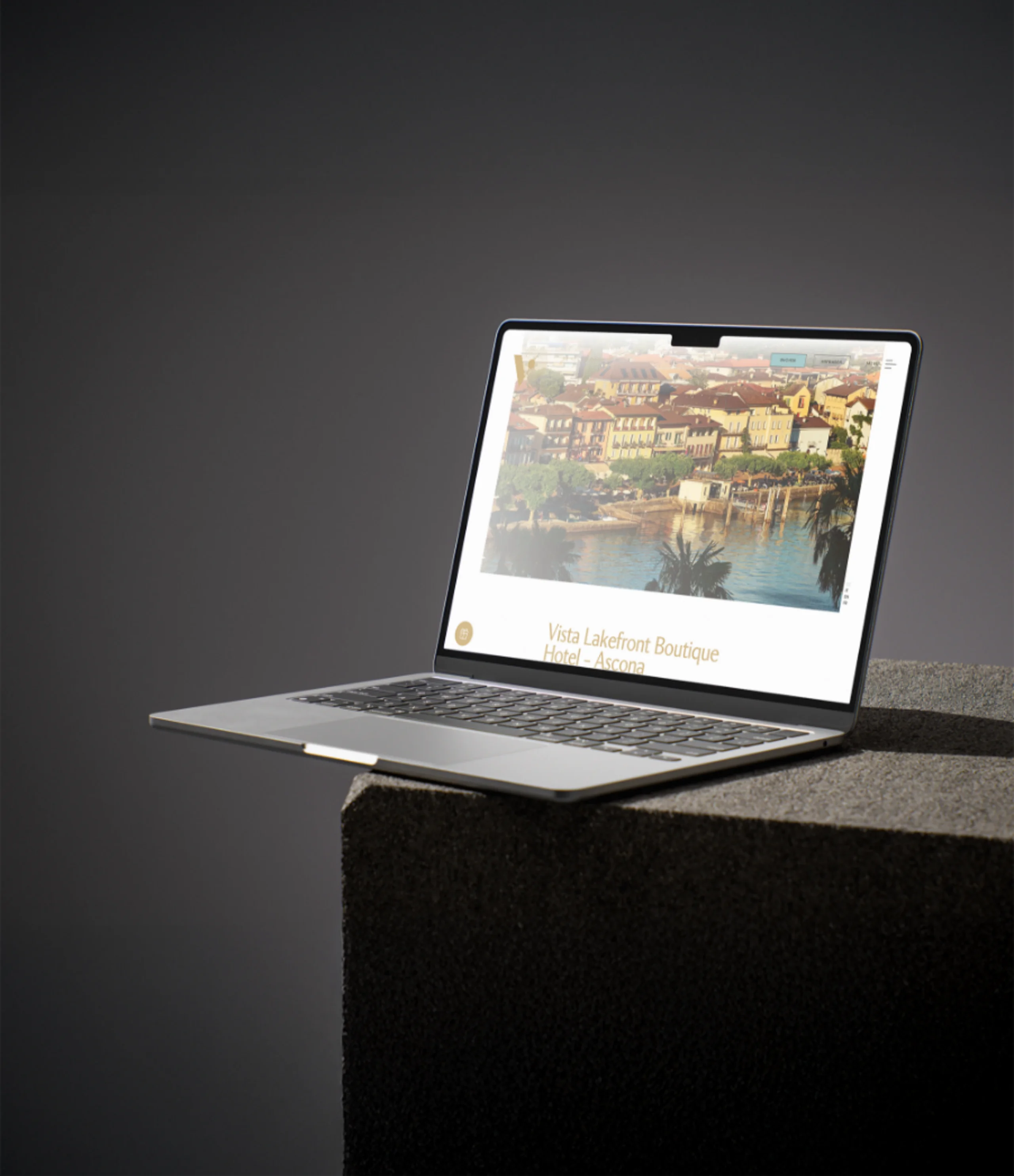
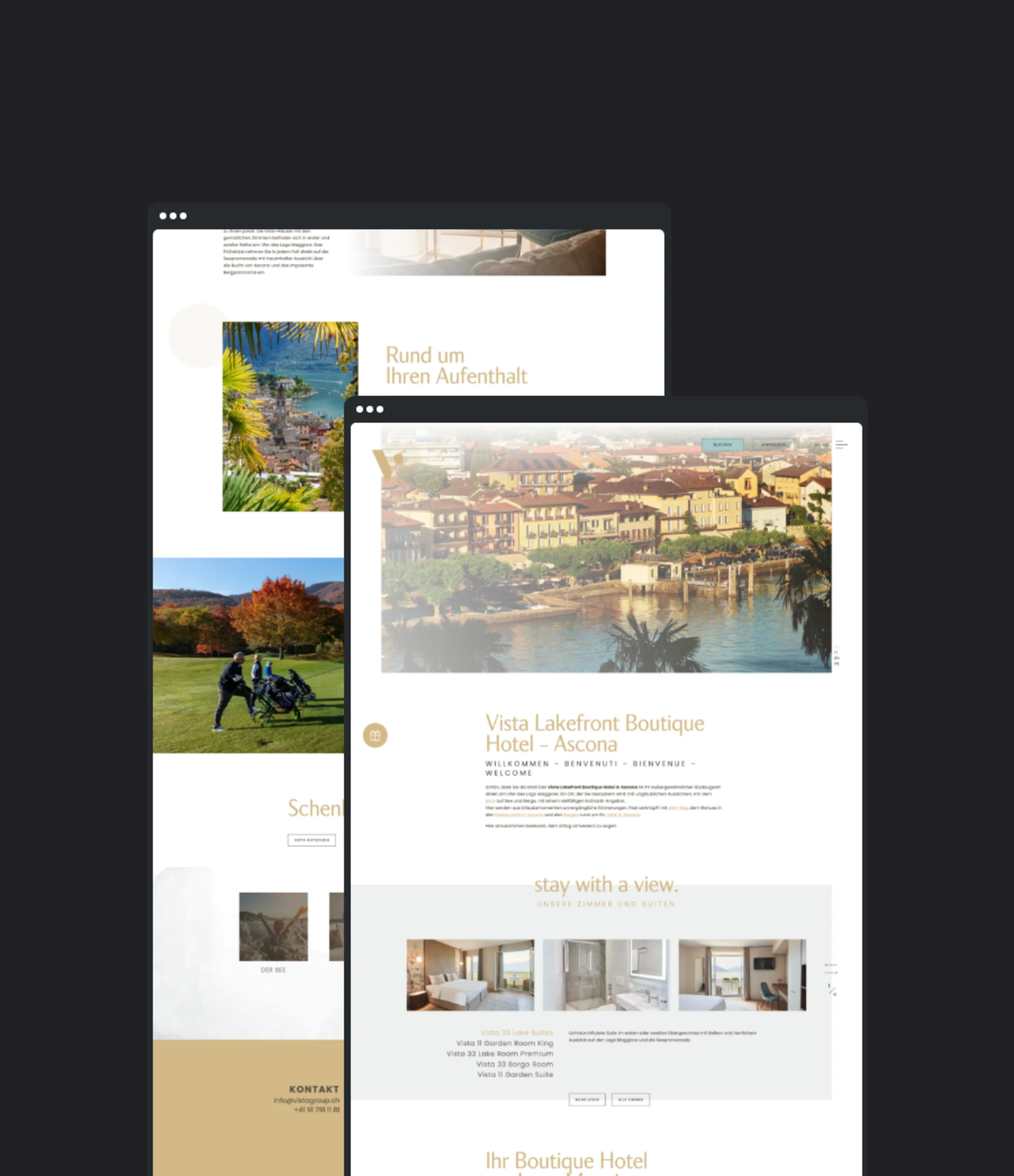
- The digital stage: a new, stunning website that brings the incredible view into guests’ living rooms from the very first click, presented in pure white and elegant gold.
Positioning | Logo & corporate design | Claim | Communication concept | Website